Tavakol Nuts

build year : 1397
location : Babol, Mazandaran
category : Commercial
area : 160m2
architect : Mojtaba Behzadmehr
design team : -
Tavakkol Store
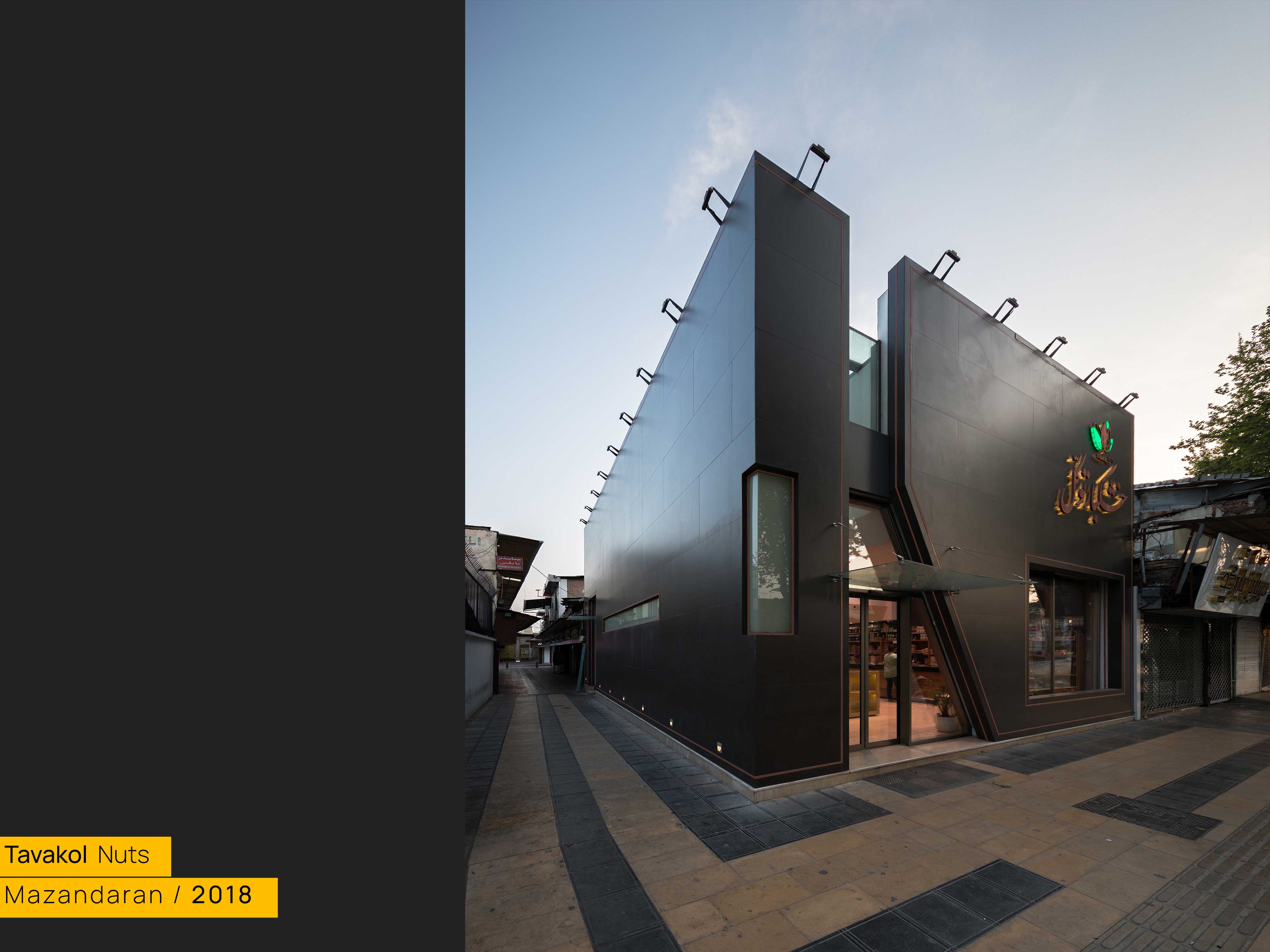
The redesign of Tavakkol brand's sales space, one of the most prestigious businesses in the field of dry goods in Babol city, covering an area of 170 square meters, aimed to revamp the overall brand identity while minimizing store closure time. The architectural approach sought to create a thought-provoking alternative to the outside world, in such a way that the encounter with any phenomenon becomes problematic and everything that previously seemed obvious, is redefined, starting from the envelope of the building to questioning the being of a scale. The goal was not simply to play with design strategies but to enhance the space's functionality and prosperity while fostering a stronger connection with the audience. Overall, Architecture can only bring people back to themselves again and again when it creates a question, a question that in turn gives architecture a special identity and distinguishes the entirety of that space from other banal ones.
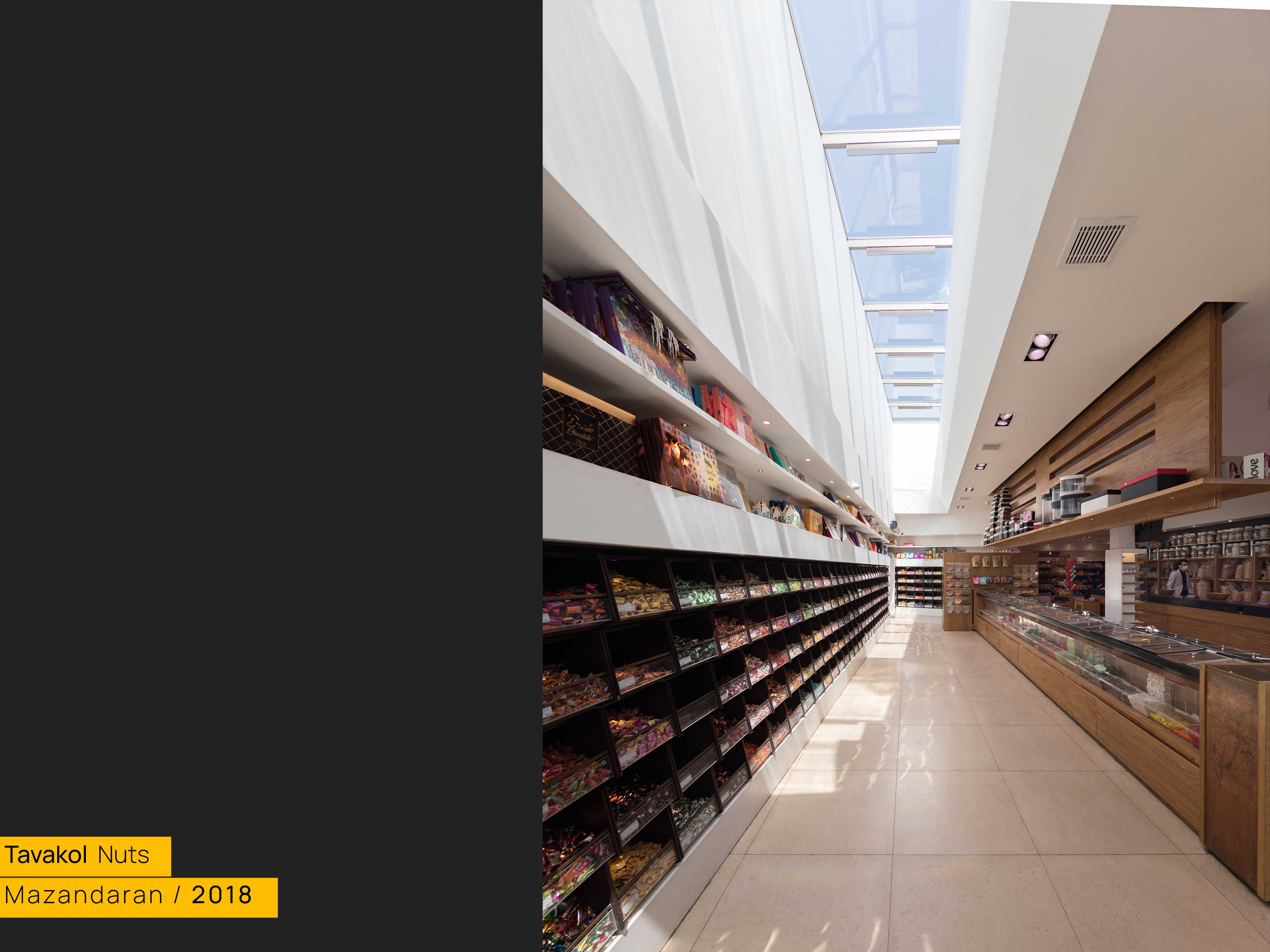
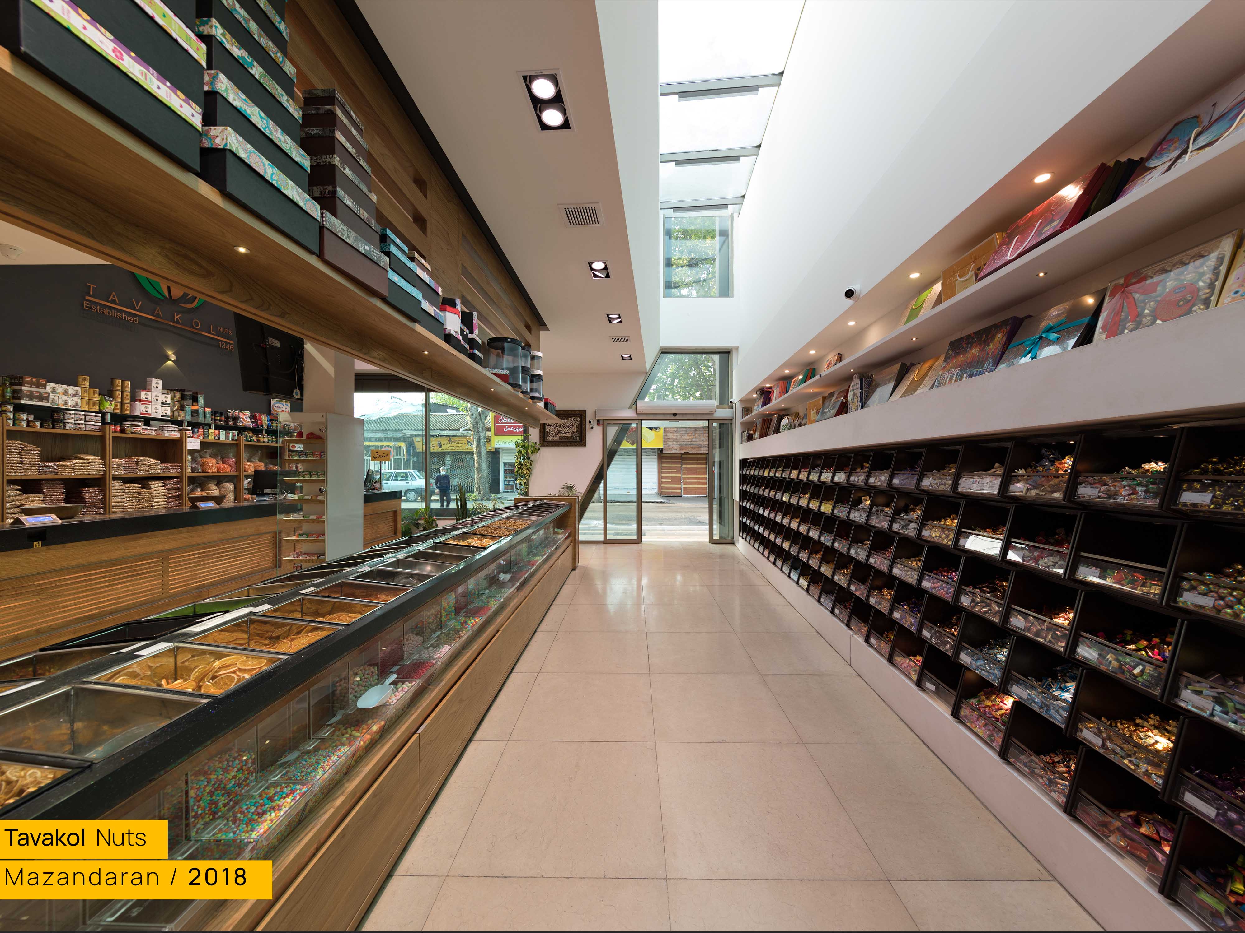
The project's concepts were explored on multiple scales, seeking to establish a distinct boundary between the interior and the city (reality) outside. The problem here is what kind of connection can be found between dry goods and architectural boundaries to create a connection between the container and the contained that also have architectural qualities. Nuts, here specifically pistachios, were endowed with qualities that had special architectural features in defining the border between outside and inside and creating a hard shell and a soft core. Drawing inspiration from the qualities of pistachios, the outer shell was designed as a solid envelope faced with black ceramics accented with copper lines, while the interior space, following the idea of the softcore, is malleably formed by different forces (such as the entry of light) and contrasts with the rigidity of the outer black shell with materials such as wood and copper. In addition to this concept, within the space, the goal has been to make three areas problematic, areas for maintenance, supply, and sales were intentionally made problematized at the points where a connection between human and body occurs.
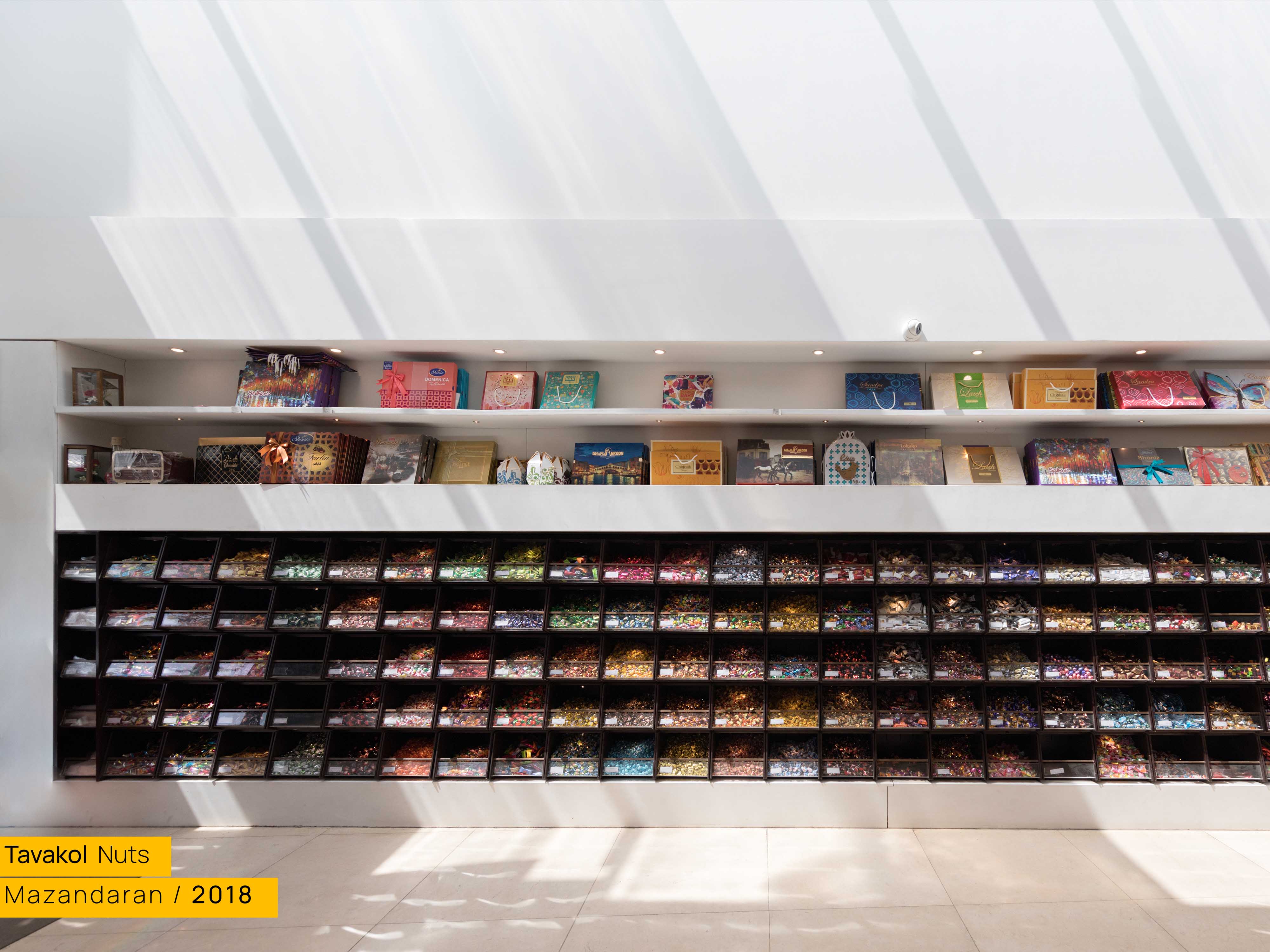
Special attention was given to product storage, with unique boxes designed to give each product its own identity. Snack storage containers featured inverted arches to hold curved boxes, while chocolate boxes were designed with innovative mechanisms to reduce wall attachment frills. Lighting solutions were also integrated into the design; In this case, for lighting, due to the absence of an external structure, there was a need for innovation in the design, which with the help of the button on the hood of the Pikan car, the possibility of lighting was provided in each box, and something like the electrical installation was involved in the identification of the collection.
In the field of supply and sales, special attention was given to moments of connection and interaction between programs. For example, the interaction between the employee and the product was emphasized in a tool called Sartas. Therefore, the choice was to deal with this element in a special way. Copper was chosen as a material that brings new aesthetic possibilities to affect the materiality of Sartas. In addition, the moments of interaction between the seller and the customer were also considered. The sales scene, which included elements such as scales and containers for mixing nuts, etc., was redefined in a way that instead of being seen as an excess on the main space, they became part of the identity and were an alternative to the usual sales situation. For example, the scale in this design was completely dismantled and its various elements were redefined by taking inspiration from the overall project and the materials used (especially copper). Even for the trash cans we used with shootings under the staff counter, which in the end an unusual shape is provided. for the opening of the project, a commercial card was designed to not only give a new definition of business promotional cards but also to have an identity in line with the identity of the space and the brand as a whole.
Designing from the spoon to the city, a slogan Ernesto Rogers made to describe the approach of some architects in Milan, can still be used as a statement to explain the approach of architects around the world. Especially for architects who, in the time of drawing, do not just design a building, but a kind of being and seeing; Like the approach that was put in the spotlight in this project and its result affected not only the beauty but also the function and identity of the project in the best possible way.


